Hello World! My name is Francisco, fcoterroba on the Internet and today I bring you a post in which we are going to celebrate, all together, the first birthday of my website, fcoterroba.com.
And as it could not be otherwise, I also bring you a post in which we are going to carry out a project for users with moderately advanced knowledge about Javascript and Node.js since we are going to use a very simple and powerful library to create 100% graphics. interactive on a web page!
As you can see in the title, this is the first part of a double-post that, although in principle they will not have much to do with each other, they will be two totally different forms, although similar and with total focus on graphics, data, etc With the website's birthday theme.
And it is true, it has been a year since I began the adventure of my life, the adventure of what I was passionate about since I was little.
And although my expectations, both monetary, because I have not earned what I thought, and in the sense of frequency, have not been optimal. I am very proud of what I have achieved, of my almost 40 posts, of the almost 10 comments with feedback from people and of all the contacts I have made.
Because, to give an example, I have TRIPLED my contacts on LinkedIn since I started the website.
I also have TRIPLED my followers on Twitter.
And I have met a lot of wonderful people along the way to whom I will be totally grateful forever.
Now we are going to get into the subject a little bit and I tell you that in order to know how to carry out this project we are going to need to know a lot about JavaScript and Node.JS. Essential technologies for the front-end of any website and even essential for any self-respecting full-stack developer.
Before starting, although later I will explain what it is, I will I recommend visiting a post that I uploaded more than a month ago, in which I explain many of the most used computer terms in our day to day. Since, in this post, you will see words that you probably do not sound a lot. 🤯 You can reed the post here.
I also want to remind you that a few months ago I uploaded a video to my YouTube channel, very interesting, focused on home automation. Specifically, we connect, configure and install a smart light bulb 💡 with which you can change its color, turn it off, turn it on and much more simply by using your mobile phone and/or voice assistants such as Google, Alexa, etc. 👇🏻
Although I haven't had much time lately (you can keep up to date with my life by following me on Twitter and LinkedIn), on the occasion of the website's birthday I wanted to do something special and a few weeks ago I thought about doing a project in which we are going to show, in a totally practical way, how to make graphs (bars, pie charts, etc.) with the data THE VISITS OF MY WEB monthly during all the year.
Then I also thought that I could get two matrices indicating the number of visits in relation to the number of posts uploaded in said month.
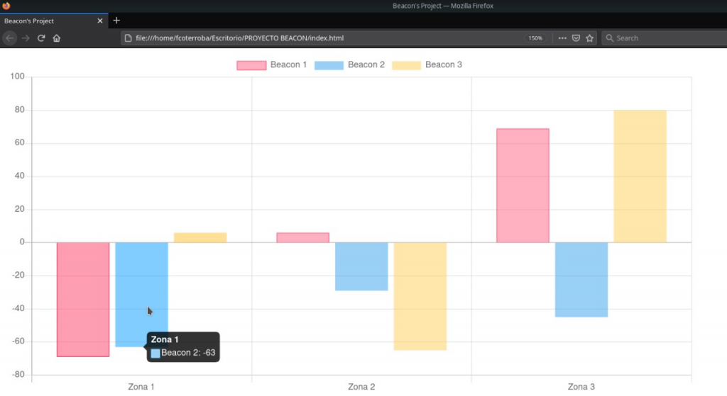
I have done this only once in my life for the final project we did at Andalucía Lab with my colleagues Carlos, Luismi and Juanan.
The project consisted of a kind of real-time and physically tracking of low latency Bluetooth devices. Commonly called Beacons.
After analyzing the behavior of users with these devices, obtaining metrics, applying Machine Learning, Deep Learning, Artificial Intelligence and much more, as a final point we decided to publish some interactive graphs on a static website where those users who are interested can obtain more information. about the data collected.
Aquí os dejo una imagen de cómo quedó y es, más o menos, lo que vamos a sacar hoy:
Do you like it? Stay, let's start now!
1️⃣ FIRST STEP 1️⃣
Be very clear about what information we can show and on what axis (X or Y).
For example, I stored the number of visits I received each month and the result was something like this:
| Abril | Mayo | Junio | Julio | Agosto | Septiembre | Octubre | Noviembre | Diciembre | Enero | Febrero | Marzo |
| 816 | 1034 | 1101 | 1250 | 1604 | 1983 | 2468 | 3021 | 2867 | 3520 | 4010 | 5097 |
2️⃣ SECOND STEP 2️⃣
Once we have our information ready, we will have to create a folder where we want and create our HTML skeleton
<!DOCTYPE html>
<html lang="en">
<head>
    <meta charset="UTF-8">
    <meta name="viewport" content="width=device-width, initial-scale=1.0">
    <title>Gráficos del primer cumpleaños de @fcoterroba.com</title>
</head>
<body>

</body>
</html>
3️⃣ THIRD STEP 3️⃣
To make graphics on the web we are going to use the open source library Chart.js. Esta librería es, tal cómo ellos se definen, «Una forma de graficar simple y flexible en Javascript para diseñadores y desarrolladores.
This library contains enormous documentation to make a lot of graphs of very different types. Although, it also has several examples with which you will simply have to copy and paste, change the values of the graphics and the color, if you want.
4️⃣ FOURTH STEP 4️⃣ — Vertical bar chart
Let's start making some graphs now. For this vertical bar graph we are going to look at the example code that appears in the library documentation. We're talking about this.
Between one thing and another, the resulting code would be something like this:
<!DOCTYPE html>
<html><link type="text/css" id="dark-mode" rel="stylesheet" href=""><style type="text/css" id="dark-mode-custom-style"></style><head>
<meta http-equiv="content-type" content="text/html; charset=UTF-8">
	<title>Estadísticas web del primer cumpleaños de @fcoterroba.com</title>
	<script async="" src="Bar%20Chart_files/analytics.js"></script><script src="Bar%20Chart_files/Chart.js"></script>
	<script src="Bar%20Chart_files/utils.js"></script>
<style type="text/css">/* Chart.js */
@keyframes chartjs-render-animation{from{opacity:.99}to{opacity:1}}.chartjs-render-monitor{animation:chartjs-render-animation 1ms}.chartjs-size-monitor,.chartjs-size-monitor-expand,.chartjs-size-monitor-shrink{position:absolute;direction:ltr;left:0;top:0;right:0;bottom:0;overflow:hidden;pointer-events:none;visibility:hidden;z-index:-1}.chartjs-size-monitor-expand>div{position:absolute;width:1000000px;height:1000000px;left:0;top:0}.chartjs-size-monitor-shrink>div{position:absolute;width:200%;height:200%;left:0;top:0}</style></head>

<body>
    <center>
	<div id="container" style="width: 75%;"><div class="chartjs-size-monitor"><div class="chartjs-size-monitor-expand"><div class=""></div></div><div class="chartjs-size-monitor-shrink"><div class=""></div></div></div>
		<canvas id="canvas" style="display: block; width: 1428px; height: 714px;" width="1428" height="714" class="chartjs-render-monitor"></canvas>
	</div>
	<script>
		var color = Chart.helpers.color;
		var barChartData = {
			labels: ['Abril', 'Mayo', 'Junio', 'Julio', 'Agosto', 'Septiembre', 'Octubre', 'Noviembre', 'Diciembre', 'Enero', 'Febrero', 'Marzo'],
			datasets: [{
				label: 'Visitas mensuales',
				backgroundColor: color(window.chartColors.green).alpha(0.5).rgbString(),
				borderColor: window.chartColors.blue,
				borderWidth: 1,
				data: [
                    816,
                    1034,
                    1101,
                    1250,
                    1604,
                    1983,
                    2468,
                    3021,
                    2867,
                    3520,
                    4010,
                    5097
				]
			}]

		};

		window.onload = function() {
			var ctx = document.getElementById('canvas').getContext('2d');
			window.myBar = new Chart(ctx, {
				type: 'bar',
				data: barChartData,
				options: {
					responsive: true,
					legend: {
						position: 'top',
					},
					title: {
						display: true,
						text: 'Estadísitcas web del primer cumpleaños de @fcoterroba.com'
					}
				}
			});

		};


    </script>
    </center>
</body>
</html>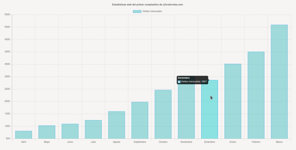
Yes, I added center tag because I am a backender and I don't know how to center anything 😂
5️⃣ FIFTH STEP 5️⃣ — Horizontal line graph
The next thing we are going to make is a line graph! In the same way as before, we can focus on this one which cames in the library's docs
In the same way as before or at least quite similar, the resulting code is as follows:
<!DOCTYPE html>
<html><link type="text/css" id="dark-mode" rel="stylesheet" href=""><style type="text/css" id="dark-mode-custom-style"></style><head>
<meta http-equiv="content-type" content="text/html; charset=UTF-8">
	<title>Line Chart</title>
	<script async="" src="grafico_lineas_files/analytics.js"></script><script src="grafico_lineas_files/Chart.js"></script>
	<script src="grafico_lineas_files/utils.js"></script>
	<style>
	canvas{
		-moz-user-select: none;
		-webkit-user-select: none;
		-ms-user-select: none;
	}
	</style>
<style type="text/css">/* Chart.js */
@keyframes chartjs-render-animation{from{opacity:.99}to{opacity:1}}.chartjs-render-monitor{animation:chartjs-render-animation 1ms}.chartjs-size-monitor,.chartjs-size-monitor-expand,.chartjs-size-monitor-shrink{position:absolute;direction:ltr;left:0;top:0;right:0;bottom:0;overflow:hidden;pointer-events:none;visibility:hidden;z-index:-1}.chartjs-size-monitor-expand>div{position:absolute;width:1000000px;height:1000000px;left:0;top:0}.chartjs-size-monitor-shrink>div{position:absolute;width:200%;height:200%;left:0;top:0}</style></head>

<body>
	<div style="width:75%;"><div class="chartjs-size-monitor"><div class="chartjs-size-monitor-expand"><div class=""></div></div><div class="chartjs-size-monitor-shrink"><div class=""></div></div></div>
		<canvas id="canvas" style="display: block; width: 1428px; height: 714px;" width="1428" height="714" class="chartjs-render-monitor"></canvas>
	</div>
	<br>
	<br>
	<script>
		var config = {
			type: 'line',
			data: {
				labels: ['Abril', 'Mayo', 'Junio', 'Julio', 'Agosto', 'Septiembre', 'Octubre', 'Noviembre', 'Diciembre', 'Enero', 'Febrero', 'Marzo'],
				datasets: [{
					label: 'Visitas mensuales',
					backgroundColor: window.chartColors.yellow,
					borderColor: window.chartColors.red,
					data: [
                        816,
                        1034,
                        1101,
                        1250,
                        1604,
                        1983,
                        2468,
                        3021,
                        2867,
                        3520,
                        4010,
                        5097
					],
					fill: false,
				}]
			},
			options: {
				responsive: true,
				title: {
					display: true,
					text: 'Estadísticas web del primer cumpleaños de @fcoterroba.com'
				},
				tooltips: {
					mode: 'index',
					intersect: false,
				},
				hover: {
					mode: 'nearest',
					intersect: true
				},
			}
		};

		window.onload = function() {
			var ctx = document.getElementById('canvas').getContext('2d');
			window.myLine = new Chart(ctx, config);
		};

	</script>
</body>
</html>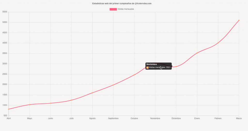
6️⃣ SIXTH STEP 6️⃣ — Graph of cheeses by quarter
Now we are going to make another similar but different graph. We are going to make a cheese graph, that is, a circle but the data is divided by quarters. I mean, in a total of three months. With this we could calculate the difference in visits between seasons of the year, for example.
For this last graph of the post we're going to use the example of the library called "Pie Chart".
This last one varies a little from the previous ones because let's say that each part is a different graph, in quotes. But in my case, it looks something like this:
<!DOCTYPE html>
<html><link type="text/css" id="dark-mode" rel="stylesheet" href=""><style type="text/css" id="dark-mode-custom-style"></style><head>
<meta http-equiv="content-type" content="text/html; charset=UTF-8">
	<title>Pie Chart</title>
	<script async="" src="Pie%20Chart_files/analytics.js"></script><script src="Pie%20Chart_files/Chart.js"></script>
	<script src="Pie%20Chart_files/utils.js"></script>
<style type="text/css">/* Chart.js */
@keyframes chartjs-render-animation{from{opacity:.99}to{opacity:1}}.chartjs-render-monitor{animation:chartjs-render-animation 1ms}.chartjs-size-monitor,.chartjs-size-monitor-expand,.chartjs-size-monitor-shrink{position:absolute;direction:ltr;left:0;top:0;right:0;bottom:0;overflow:hidden;pointer-events:none;visibility:hidden;z-index:-1}.chartjs-size-monitor-expand>div{position:absolute;width:1000000px;height:1000000px;left:0;top:0}.chartjs-size-monitor-shrink>div{position:absolute;width:200%;height:200%;left:0;top:0}</style></head>

<body>
	<center>
	<div id="canvas-holder" style="width:40%"><div class="chartjs-size-monitor"><div class="chartjs-size-monitor-expand"><div class=""></div></div><div class="chartjs-size-monitor-shrink"><div class=""></div></div></div>
		<canvas id="chart-area" style="display: block; width: 762px; height: 381px;" width="762" height="381" class="chartjs-render-monitor"></canvas>
	</div>
	<script>

		var config = {
			type: 'pie',
			data: {
				datasets: [{
					data: [
						2951,
						4837,
						8356,
						12627
					],
					backgroundColor: [
						window.chartColors.blue,
						window.chartColors.yellow,
						window.chartColors.orange,
						window.chartColors.green,
					],
					label: 'Dataset 1'
				}],
				labels: [
					'1º trimestre: Abril-Junio',
					'2º trimestre: Julio-Septiembre',
					'3º trimestre: Octubre-Diciembre',
					'4º trimestre: Enero-Marzo'
				]
			},
			options: {
				responsive: true,
				title: {
					display: true,
					text: 'Estadísticas web del primer cumpleaños de @fcoterroba.com'
			}
			},
		};

		window.onload = function() {
			var ctx = document.getElementById('chart-area').getContext('2d');
			window.myPie = new Chart(ctx, config);
		};
	</script>
	</center>
</body>
</html>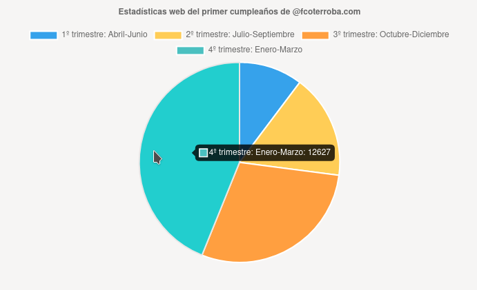
En todas las gráficas, si te das cuenta, cambian cuatro cosas entre el tipo de gráfica pero lo importante es la información básicamente principal que se modifica en «labels» para establecer un nombre al pie de cada barra y «data» que es el dato en sí.
Then there are a lot of modifiable things like height, size, colors, color alpha, etc.
And tha'ts was all for today, guys! I hope you liked it, thank you all for being there with me during this long, expensive but happy year! 🙂 I hope to see you for much more. See you soon!
Remind you that you can see the repository of this extension and many more in my personal profile GitHub!. In addition to inviting you to follow me on my Twitter, Facebook, Instagram and LinkedIn.
Finally, remind you that if you like my content and want to contribute financially (since I don't earn anything from Adsense), you can send me the amount you want for Paypal. Any amount is well received! 🙂