Hello World! My name is Francisco, fcoterroba on the Internet and today I bring you a post in which we are going to continue celebrating, even though almost 1 month has passed, the first birthday of the website!
And how could it be any other way, I couldn't leave you with honey on your lips. Yes, it is very good and very nice to make graphics for the web using JavaScript, but what do you say if I tell you that we can also make those same graphics but using a language as powerful as Python? You like it right? Well, stay, let's start now!
As you can see in the title, if you are not very clueless, this is the second part of a double post that I already uploaded in the previous post doing something quite similar to what we are going to do now but focused on a web page! We use JavaScript to make interactive and dynamic graphics without using any server. Everything very static!
As in the previous post, we are going to use the same data, we will make very similar graphs and so on, but I am sure that this post can be a bridge to your future! Python is very interesting and has incredible potential in the entire field of computing, artificial intelligence, machine learning, cloud computing, etc.
And it is true, it has been a year since I began the adventure of my life, the adventure of what I was passionate about since I was little.
And although my expectations, both monetary, because I have not earned what I thought, and in the sense of frequency, have not been optimal. I am very proud of what I have achieved, of my almost 40 posts, of the almost 10 comments with feedback from people and of all the contacts I have made.
Because, to give an example, I have TRIPLED my contacts on LinkedIn since I started the website.
I also have TRIPLED my followers on Twitter.
And I have met a lot of wonderful people along the way to whom I will be totally grateful forever.
Before starting, although later I will explain what it is, I will I recommend visiting a post that I uploaded more than a month ago, in which I explain many of the most used computer terms in our day to day. Since, in this post, you will see words that you probably do not sound a lot. 🤯 You can reed the post here.
I also want to remind you that a few months ago I uploaded a video to my YouTube channel, very interesting, focused on home automation. Specifically, we connect, configure and install a smart light bulb 💡 with which you can change its color, turn it off, turn it on and much more simply by using your mobile phone and/or voice assistants such as Google, Alexa, etc. 👇🏻
Although I haven't had much time lately (you can keep up to date with my life by following me on Twitter and LinkedIn), on the occasion of the website's birthday I wanted to do something special and a few weeks ago I thought about doing a project in which we are going to show, in a totally practical way, how to make graphs (bars, pie charts, etc.) with the data THE VISITS OF MY WEB monthly during all the year.
Then I also thought that I could get two matrices indicating the number of visits in relation to the number of posts uploaded in said month.
I have done this only once in my life for the final project we did at Andalucía Lab with my colleagues Carlos, Luismi and Juanan.
The project consisted of a kind of real-time and physically tracking of low latency Bluetooth devices. Commonly called Beacons.
After analyzing the behavior of users with these devices, obtaining metrics, applying Machine Learning, Deep Learning, Artificial Intelligence and much more, as a final point we decided to publish some interactive graphs on a static website where those users who are interested can obtain more information. about the data collected.
Do you like it? Stay, let's start now!
1️⃣ FIRST STEP 1️⃣
As in the previous post, we must keep in mind what data we are going to put in our graph, and although I already wrote it in the previous post, I am putting in duplicate the information that we are going to represent in this case.
| Abril | Mayo | Junio | Julio | Agosto | Septiembre | Octubre | Noviembre | Diciembre | Enero | Febrero | Marzo |
| 816 | 1034 | 1101 | 1250 | 1604 | 1983 | 2468 | 3021 | 2867 | 3520 | 4010 | 5097 |
2️⃣ SECOND STEP 2️⃣
Open our favorite code editor (which in my case is VSCodium) and install the package we need to generate graphs. Matplotlib. The command to perform this installation is:
pip install matplotlib
3️⃣ THIRD STEP 3️⃣
Create a file with a .py extension and import the library that we have previously installed.
import matplotlib.pyplot as plt

print("Hola! Has importado correctamente la librería de MatPlotLib")
As you already know, we can check the operation of the script by writing python script_name.py
4️⃣ FOURTH STEP 4️⃣ — Vertical bar chart
The first thing we will have to do is declare two arrays, one for the X axis in which we put the names of the months and another for the Y axis where the number of visits appears. It could be something like this:
import matplotlib.pyplot as plt

def grafico_barra_vertical():
  meses = ["Abril", "Mayo", "Junio", "Julio", "Agosto", "Septiembre", "Octubre", "Noviembre", "Diciembre", "Enero", "Febrero", "Marzo"]
  visitas = [816, 1034, 1101, 1250, 1604, 1983, 2468, 3021, 2867, 3520, 4010, 5097]
Subsequently, we must create the matplotlib object, establish a label for the Y axis, another for the X axis and transfer the two arrays that we have created to the object created before.
Finally, we will use the function show to show the graph.
import matplotlib.pyplot as plt

def grafico_barra_vertical():
  	# Make the arrays with the info
    meses = ["Abril", "Mayo", "Junio", "Julio", "Agosto", "Septiembre", "Octubre", "Noviembre", "Diciembre", "Enero", "Febrero", "Marzo"]
    visitas = [816, 1034, 1101, 1250, 1604, 1983, 2468, 3021, 2867, 3520, 4010, 5097]

    # Make the object
    fig, ax = plt.subplots()

    # Label for Y
    ax.set_ylabel('Visitas')
    # Label for X
    ax.set_title('Visitas en el primer aniversario de la web')

    # Set the arrays to the X and Y
    plt.bar(meses, visitas)

    # Show the chart
    plt.show()

if __name__ == "__main__":
    grafico_barra_vertical()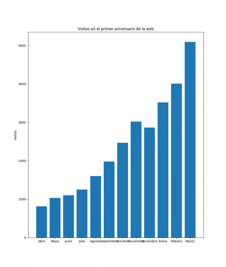
5️⃣ FIFTH STEP 5️⃣ — Horizontal line graph
For a little change, I'm going to do this fifth step without adding a lot of labels or anything like that so you can see how easy it can be to create a graph using Python and plt.
Simply we use the function plot , passing the arrays and we show it.
import matplotlib.pyplot as plt

def grafico_lineas_horizontal():

    # Make a plot with data
    plt.plot(meses, visitas)

    # Show the chart
    plt.show()

if __name__ == "__main__":
    # grafico_barra_vertical()
    grafico_lineas_horizontal()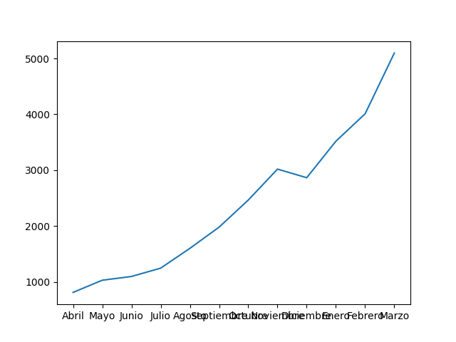
6️⃣ SIXTH STEP 6️⃣ — Graph of cheeses by quarter
For this last exercise we are going to create two more arrays, combining the data by quarters to end up creating a graph of cheeses, portions or cake. With this we could calculate the difference in visits between seasons of the year, for example.
For this we will simply have to create the method pie passing the numerical data and the month label as parameters
import matplotlib.pyplot as plt

# Make the arrays with trimester data
months = ["1º trimestre: Abril-Junio", "2º trimestre: Julio-Septiembre", "3º trimestre: Octubre-Diciembre", "4º trimestre: Enero-Marzo"]
visits_trimester = [2951, 4837, 8356, 12627]

def grafico_tarta_trimestral():

    # Make a plot with the data and labels
    plt.pie(visits_trimester, labels = months)
    plt.show()

if __name__ == "__main__":
    # grafico_barra_vertical()
    # grafico_lineas_horizontal()
    grafico_tarta_trimestral()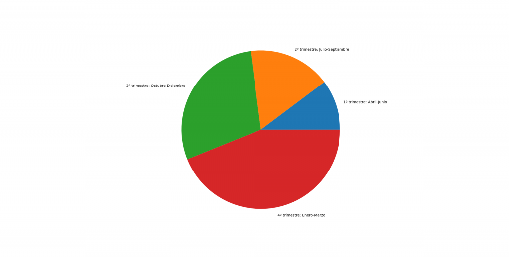
And that would really be all for today. As you can see, matplotlib is a very light library, very simple and with many possibilities.
You will also have noticed that when we show any of the graphs, a window opens which is a bit interactive. With this window we can expand a certain range, save the image in png format, etc.
I hope you liked it, thank you all for being there with me during this long, expensive but happy year! 🙂 I hope to see you for much more. See you soon!
Remind you that you can see the repository of this extension and many more in my personal profile GitHub!. In addition to inviting you to follow me on my Twitter, Facebook, Instagram and LinkedIn.
Finally, remind you that if you like my content and want to contribute financially (since I don't earn anything from Adsense), you can send me the amount you want for Paypal. Any amount is well received! 🙂